The Last Spire Released!
My new incremental/tower-defense game has arrived! You can play below for free:
https://ome6a1717.itch.io/the-last-spire
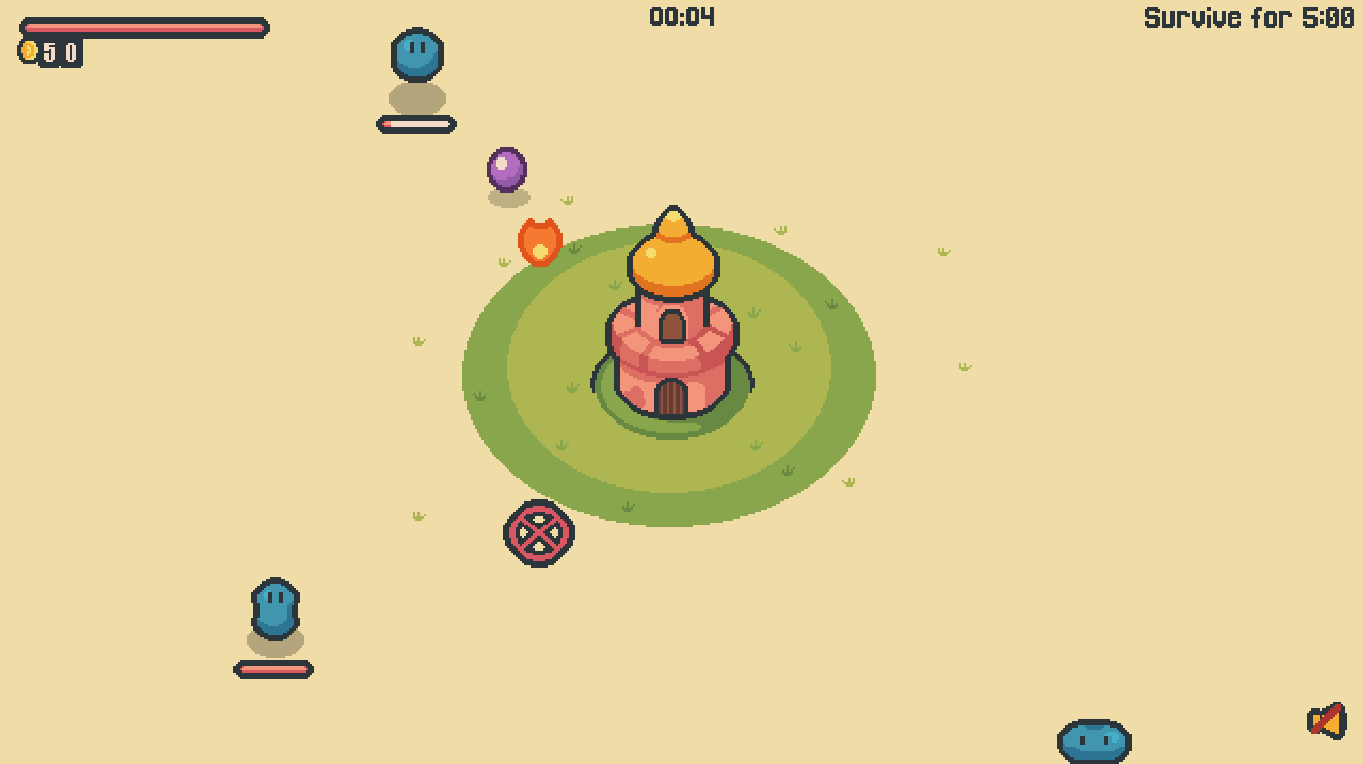
In The Last Spire, a lone tower stands between civilization and an endless tide of hungry blobs. As the invasion accelerates and your foes grow tougher, only your wit—and a steadily improving arsenal—can save the day. Unlock achievements to gain access to new defenses, earn coins to upgrade and evolve your weapons, and watch the tide of goo melt away… for now.
Comments
Log in with itch.io to leave a comment.
MY RUN: 16 Rounds, 1004 enemies, 40 mins. Feedback below.
- Toony artstyle works. For sound, play Love in a Dangerous Space Time to see how they do cartoony sound effects so well.
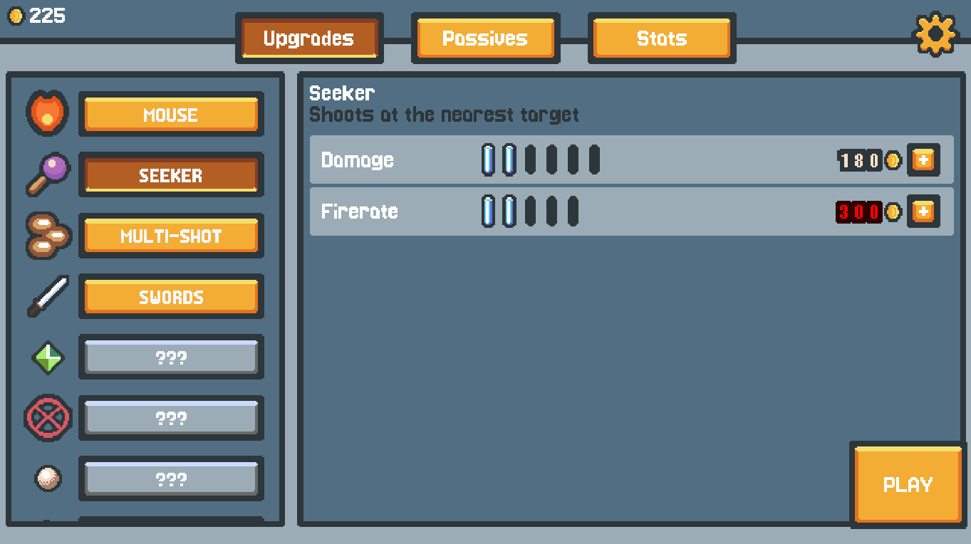
- I love that when you unlock an ability, it auto-actives on the current level. I don't have to wait until the next round to see what it does. It was a pleasing surprise as I unlocked upgrades.
ADD / ADJUST FEATURES:
- Reset/Restock: To get all my coins back and reset my upgrades. So I can try other builds faster.
- Add Coins Collected into the Stats.
- Prices: Cost Jumps from 50 or 75 then to 300 for certain upgrades. It's a bit jarring. Edit the numbers so at this early demo stage so players can experience features faster.
- Fireball-Mouse upgrade needs more impact. When I bought the higher-priced firerate, I expected two fireballs to fire in succession (more fireballs in less time). I like the option like Multi-shot to upgrade the amount of projectiles. Two fireballs in close success would be much cooler, if I'm spending 500 on fire-rate. Or an option to increase the AOE.
- Adjust spawn area for enemies. Feels awful when enemies spawn behind the clock and above in top-midpoint of the screen. Those ones get to me so much faster than all the other enemies. Doesn't seem right at all. Make it so enemies don't spawn in the area where the timer is and don't spawn in the mid-point above your castle.
UI RELATED:
- The passive page scrolls down but it's not obvious. Need a down arrow or a scroll bar in UI.
-Add Controls page or an intro screen telling how the flow works. Add "Guide" screen next to the "Upgrades" "Passives" "Stats" screens.
- Default Master Volume is set to 0. Maybe set it to 1 or 2 so it's low, so that players at least know there is sound first that first impression. I played 7 rounds until I saw the Master Volume was 0.
- Move the Settings gear to a different part of the screen or make an Options subpage. I recommend an "Stats and Options" combined screen. Right now your Stats page has so much empty space.
- I'd change where your Settings gear is placed as well as the Sound/Mute icon. Right now the Itch.io website UI is in the way of the gear icon. (When logged in, there the "View all by" "Follow" "Add to" and "Rate this game" itch.io site buttons that are directly above the gear icon.