
AutoUi for GameMaker
AutoUi is a powerful and flexible UI package built specifically for GameMaker developers who want fast, modular, and highly customizable user interfaces. Designed with both simplicity and scalability in mind, AutoUi allows you to create fully responsive menus, sliders, buttons, lifebars, scroll areas, text inputs, and more—with minimal code and maximum control.
Featuring simple-to-use constructor-based elements, dynamic layout management (horizontal and vertical containers), alignment options, and built-in interactivity, AutoUi makes UI creation intuitive and efficient. Each element automatically calculates its dimensions and positioning, letting you focus on design instead of pixel math.
AutoUi can create buttons, checkboxes, radioboxes, sliders, labels, images, and more with just a single line of code! You have also have plenty of customization options for each individual element.
Whether you're building a full options menu, a character builder, or just a few tooltips, AutoUi’s streamlined architecture adapts to your workflow—AutoUi gives you the tools to build fast and polish faster.
Current Element List
(as of 2025/12/09)
- LABEL
- Simple text (accepts spritefonts and font objects), with one-line typewriting, optional nine_slice background with user-set padding, optional indentation and more.
- IMAGE
- Show any sprite animated or held on a frame with optional auto-centering (calculates the position regardless of the origin point.)
- CHECKBOX
- Image/text checkbox that is checkable/hoverable, allowing the user to set the hovered/click frames for both checked/unchecked. You can also set the frame duration the click frame shows upon click, as well as change the orientation of the text from the image (from left to right).
- RADIOBOX/RADIOGROUPS
- Inheriting the checkbox above, the radiobox has the addition of being able to add to a Radiogroup object which will uncheck all other objects in the group when checked.
- LIFEBAR
- A simple nine slice background with a nine slice hp bar. You can set the value, padding of the interior bar, set a tween/speed on value change, and even add a secondary bar behind the main bar (eg. to show the damage taken)
- SEGMENTED LIFEBAR
- Similar to above, this one takes a nine slice background and a segment sprite (i.e. a heart sprite), and upon entering the amount of segments, will appropriately space them and subtract/add them similar to the lifebar.
- RECTANGLE
- A simple draw_rectangle with a start/end indentation. Made for dividers, or even hoverable boxes.
- SCOLLBAR
- A scroll area that allows a container of whatever elements you would like to scroll (using surfaces). Includes mouse support for mouse wheel, clicking the scrollbar and moving it, but also gamepad variability like "scroll_to_next_item", "scroll_to_top", etc.
- SIZED BOX
- Empty space to add to a container between elements. You can also use flexcontainer.add_space(<value>) to add this without needing to instantiate this element.
- SLIDER
- A horizontal/vertical slider that takes a handle sprite and background nine slice with complete mouse support. You set a min/max value of the slider, and can optionally snap the values by a user-set increment.
- TEXT EDITOR
- A selectable single-line text editor that allows you to focus, type, delete, add keys to allow/ignore, and other useful features.
- BUTTON
- A button that takes a 6-frame sprite or nine-slice (checked, unchecked, checked hovering, unchecked not hovering, checked click, unchecked click), and puts text on the button to any horizontal alignment. Includes built in mouse functionality out of the box.
- NINE-SLICE
- A stretched sprite that filles the width of a vertical container or height of a horizontal container.
- ROW (CONTAINER)
- A horizontal row that allows you to place any number of elements to the left, center, and right side with optional spacing/padding.
- DIAL (CONTAINER)
- A horizontal/vertical infinitely rotating dial of AutoUi elements
- STACK (CONTAINER)
- A stack (container) of elements that are placed one after another (useful for inventories, or equipment backgrounds with icons.)
- FLEX CONTAINER (CONTAINER)
- A vertical/horizontal container that resizes based on the elements added to them. You can set the padding/spacing of the elements within, change the draw anchor position, and plenty more customization options.
Below is a video overview of the Ui system, and below that is a list of features and GIF examples.
KEY FEATURES
Rapid UI Construction
- Build interfaces with minimal code using modular constructors like labels, images, sliders, and scrollbars.
- The flexible container system automatically handles padding, alignment, and layout flow without any extra input. Widgets adapt fluidly to their container's constraints—no manual math or recalculations required.
Tons of built-in functionality
- Built-in tweening, one-line typewriting, full mouse hover/click control, and more are built right under the hood.
Fully Skinnable
- Incredibly easy to customize UI with sprites, fonts, and nine-slices.
- Easily adjust font, padding, indentation, alignment, and formatting on the fly with simple single-line methods.
Full Documentation
- Included is a note document for each element with fully detailed methods, variables, and explanations to make it as easy as possible to understand.
Below are some code > build examples on how simple building your UI can be:
EXAMPLES
The following code shows how all UI with AutoUi is made. Create an object, and in the Create Event you can initialize the elements. Then in the Step Event call step(<x>, <y>), and put draw() in the draw event. That's it!
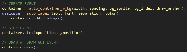
And in turn, the code creates the following a simple dialogue text:

As you can see, the wrap_width is automatically set. If we were to change the width of the container, the wrap_width would automatically adjust. The same would happen if we were to change the padding of the container.
Let's look at another small example - a simple tooltip:
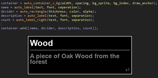
Here we're adding multiple elements to the container now, and as you can see they will stack vertically (due to the auto_container_v_bg).
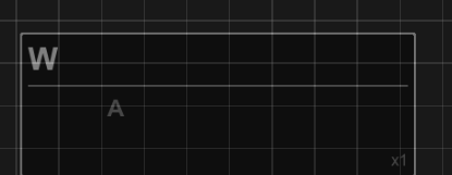
And with a simple addition, you can add a nice typewrite effect (with optional parameters to control the speed), and an indent to the description text:
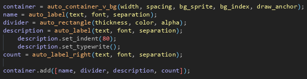
Resulting in:
Let's now look at some useful functions under the hood and create a modal dialog box!
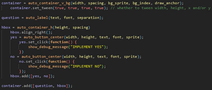

Hopefully you can start to see how easy it is to create a modular UI, allowing you to change elements individually, add extra padding, or simply adjust the order of the elements without the headache of coding it manually!
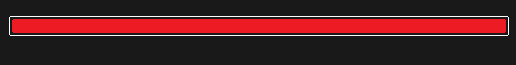
Now, let's take a look at another element - the health bar:
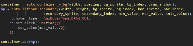
All of the tweening speeds, hold timer for the optional secondary orange bar, and tweening values are completely adjustable, too. No more trying to figure out the math for the current value based on width of the bar!
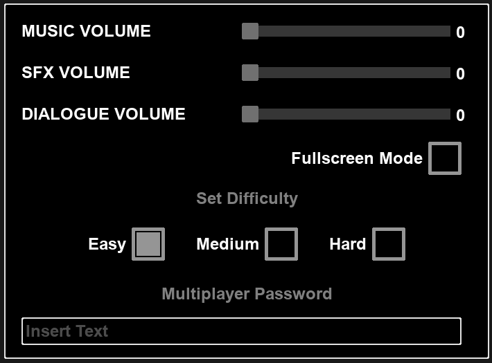
You can also see how powerful this UI system by looking at this simple options menu made with only ~47 lines of code! (This is one of the example objects available in the package with a detailed explanation for each line of code):
And last but CERTAINLY not least, any of these objects can be placed in a scroller for vertical or horizontal scrolling with full mouse control, snap to item index, and more useful functions!
There are so many features and functions in this package, it's quite difficult to show everything here. Below are some .gifs of games using this system:

So, if you're still not convinced, feel free to leave a comment with any questions!
In addition to ALL of these elements, there are other unique built-in mechanics to make your life easier so you can spend less time coding and more time designing!
- SIGNALS
- Sets an element to watch a variable, and if it changes, update that variable
hp_label.connect_signal_text(o_player, "hp")
// Each time o_player.hp is updated, the text will change automatically!)
- WATCHERS
- Similar to signals, this will watch a variable and if it changes, instead it will call a function of your choice. (eg. hp_label.add_watcher(o_player, "hp",
hp_label.add_watcher(o_player, "hp", function(_new_value) {
    set_text(string(_new_value) + "/100");
});
- HUNDREDS of built-in constructor methods for all elements
<element>.align_right(), .align_left(), align_center(), etc.
<element>.get_bbox positions, get_total_width/height()
<element>.set_visible()
<element>.set_click/hovering/cancel_hovering/right_click functions
<element>.one_shot_animation (plays a single sprite animation at a designated x/y position)
<label>.set_indent, set_typewrite_change/finished functions
<lifebar>.set_tween_speeds, set_padding, etc.
<scrollbar>.scroll next/prev item, scroll to item index, etc.
And MANY more!
What will I receive?
You will receive a .yymps file you can drag into your GM project. It requires NO ADDITIONAL THIRD PARTY PACKAGES. Everything was made in GM. The only files you absolutely need for it to function are the scripts folder. In the package will also include a NOTES folder with the documentation for each method (although the constructor scripts are well commented, the documentation does add another degree of clarity), as well as a few example objects/sprites that I urge you to look through to understand how the system works.
The license upon purchase allows you to use this package on any commercial or hobby project, but does not allow the reselling or repackaging of the library.
So, what's next?
Well, you tell me! I'm keen to hear about your thoughts on the package, and what elements you feel are missing from it, as I would love to continue to add free updates. So let me know in the comments!
Do you use GameMaker and interested in fast-tracking your development? Make sure you check out my other Auto packages!
Purchase
In order to download this asset pack you must purchase it at or above the minimum price of $10.50 USD. You will get access to the following files:
Development log
- AutoUi Update v1.3.0!12 days ago
- AutoUi Update v1.2.2!53 days ago
- AutoUi Update v1.2.0!86 days ago
- AutoUi Update v1.1.2!Aug 23, 2025
- AutoUi Update v1.1.0!Jul 20, 2025
- AutoUi - A UI System for GameMakerApr 09, 2025